
The Best Exterior Paint Colors for San Diego Homes: Light, Roof Tile, and What Fades
Joe Penney has been painting in San Diego County since 2007 and in the trade for over 35 years. Every job — residential, commercial, and specialty coatings — is run by Joe or his son Alex personally. No subcontractors, no franchise crews. CA License #794402-C33.
Quick answer
The exterior paint colors that work in San Diego are the ones chosen on the wall, not on the chip. Our light is bright, and near the coast it is cool, so colors read lighter and cooler here than they did in the store. Warm whites, sand and greige, olive and sage greens, and low-chroma earth tones hold up best; deep reds and bright blues fade first on south and west elevations. Exterior paint in San Diego generally lasts 7 to 12 years, so this is a decision you live with for closer to a decade than a season.
Open any fan deck and you will find forty shades of white named after breakfast — oatmeal, cream, biscuit, eggshell, linen. Under store lights they all look like white. Get one onto two thousand square feet of stucco in full sun and it turns out to have opinions. A chip is two inches square and lives indoors; your house is large and lives outside, in the brightest light most people ever paint in. The chip has never won that argument.
This guide is about choosing exterior paint colors for a San Diego home, and only that — not what a repaint costs, not which coating belongs on your stucco, not when to schedule it. We have written all three and linked them where they belong. We have painted San Diego County exteriors since 2007, with 35+ years in the trade behind the crew and zero subcontractors.
Why San Diego light changes the color you pick
Colors read lighter here than on the chip, and near the water they read cooler. That one sentence explains most exterior color regret in this county. The showroom you chose in was lit at a fraction of the intensity hitting your south wall at one in the afternoon, and intense light washes chroma out of a color. Whatever looked right indoors, go one to two steps deeper on the strip for the body.
Light here is not one thing, either. Within a mile of the water it is cool, coming off a large blue-grey reflector of sky and ocean, so a white with a cold base looks institutional on a La Jolla elevation and a fashionable cool grey can go frankly blue by mid-afternoon. Fifteen miles inland, in La Mesa or El Cajon, the light is warmer and drier and the same greige swings toward yellow or pink.
Add the marine layer, which owns roughly May through September on the coast. On a marine-layer morning there is no direct sun at all, just flat white overcast, and every color goes muted and slightly grey. By four in the afternoon that same west wall is in low, warm, direct sun and looks like a different color. Both are your house.
Two more things move the color once it is on the wall. Bounce: a terracotta roof throws warm orange light onto the top third of the walls, a lawn throws green up from below. Texture: sand, lace, or dash stucco creates thousands of tiny shadows, so a color reads deeper on stucco than on a smooth card. Bright light pushes it lighter, texture pulls it back, and where the two land is hard to predict from a chip.
How to sample so the color you pick is the color you get
Sample large, sample on the actual house, and look at it at three times of day for at least three days. That is the whole method, and it costs a few sample quarts and a week of no effort.
Narrow to four colors before you spend anything. Pick finalists outdoors, in daylight, holding the chip flat against the wall rather than up in the air where it catches sky. Two is not enough to see the range and eight turns into a committee. Then buy sample quarts of all four — not chips, not printed swatches, and not a rendering off a website.
Paint each sample at least two feet by two feet, two coats. One coat over an existing color is that color plus whatever is underneath. If the existing color is dark, prime a white band first and put the sample inside it, because a patch ringed by the old color looks wrong by contrast.
Put samples on three elevations, not one. This is the step people skip and the one that matters most here. The front, because that is what the street sees. A south or west wall, where the color is loudest and fades first. A north wall, the shaded version, where a cool-based color goes grey and dead. Place each patch next to what you are not changing — the roof line where the wall meets fascia, the window frames, any stone or brick that stays — because that junction is where a bad pairing shows first and almost nobody tests it.
Look at three times of day: early morning, ideally overcast; midday, full sun; then between four and six, when the light goes warm and low and every undertone comes out to introduce itself. That last one is when pink shows up in a greige. Look from the street rather than from arm's length, and sample in the sheen you will actually use, because sheen changes apparent color.
Here is the opinion, and we will defend it. Almost every case of exterior color regret we have been called back to fix in San Diego was a sampling failure, not a taste failure. The homeowner had good taste. They chose in a store, in an hour, under lights with nothing in common with the light their house lives in, for a coating that stays on the building 7 to 12 years. Spend the week.

The color families that work here
Five families cover almost every exterior we paint in San Diego County: white and off-white, warm sand and greige, sage and muted green, low-chroma earth tones, and charcoal-to-black as an accent. The difference between a considered scheme and a builder default is almost always undertone, not family.
White and off-white on stucco
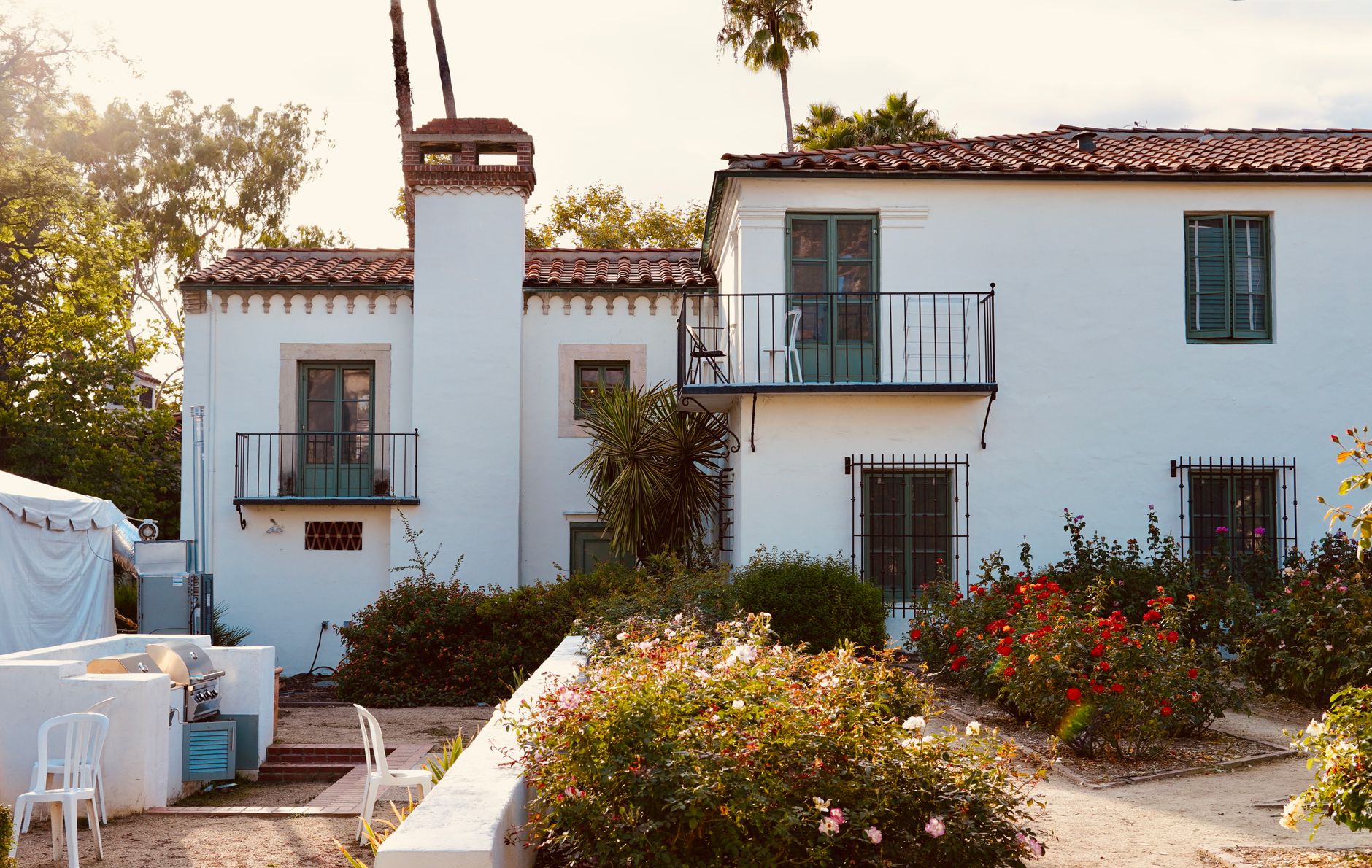
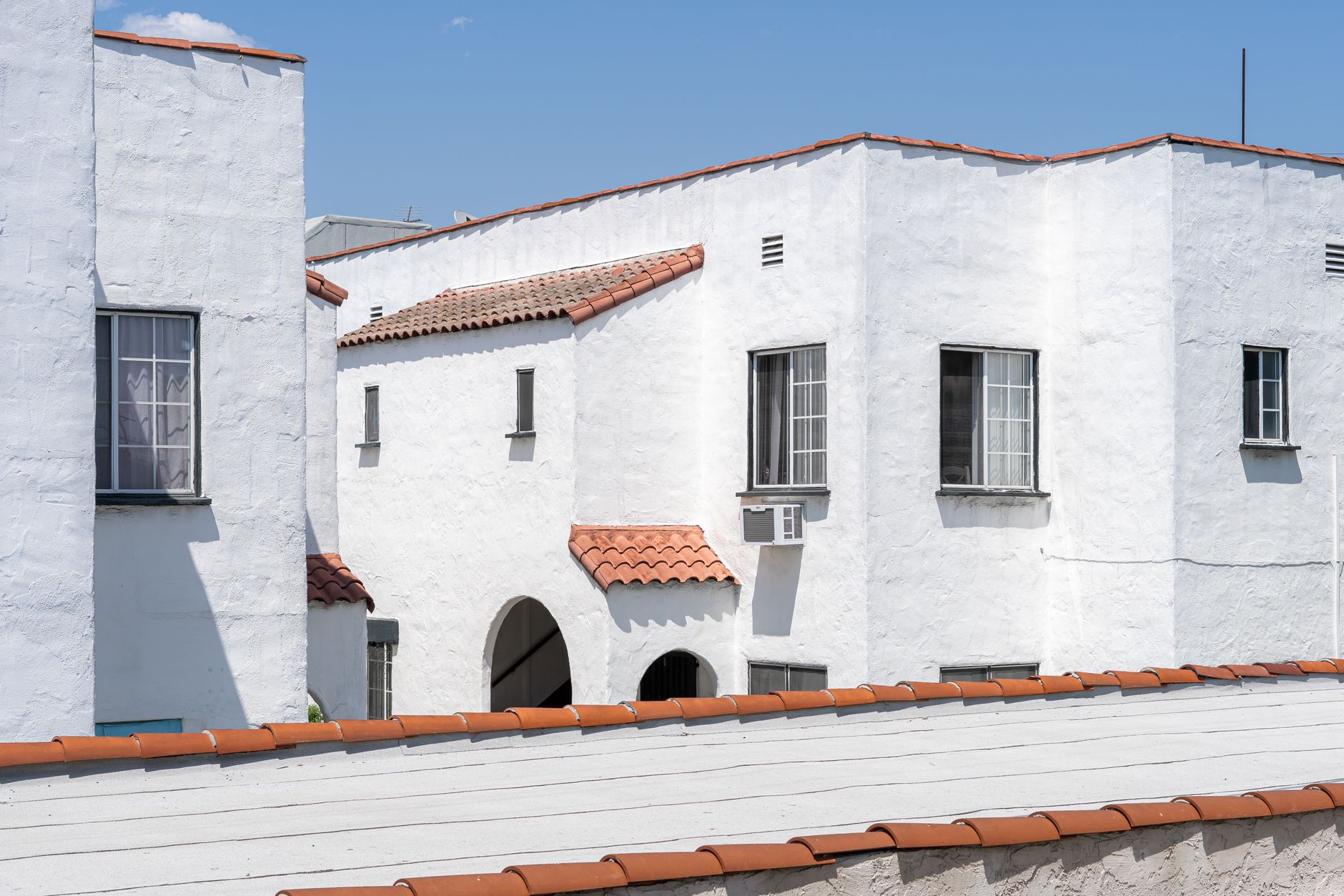
White is the regional default and it earns it — it reflects heat, flatters Spanish and Mediterranean architecture, sits well against terracotta, and ages gracefully in strong UV because there is less pigment to lose. The decision is not whether to go white. It is which one.
A pure, blue-leaning white on a large stucco field glares at midday and telegraphs every patch, crack repair, and texture mismatch on the wall. Softer whites with a gentle warm or greige base — the two most commonly specified being Benjamin Moore White Dove and Sherwin-Williams Alabaster — do the same job without the glare. On the coast, lean warmer than you think: a white that looked slightly creamy on the chip reads clean on a Coronado or Del Mar elevation, while a crisp indoor white goes grey out there.
Warm sand, greige, and taupe
The workhorse family for San Diego stucco and the most requested body range we mix. It reads clean without glaring, pairs with clay tile, and hides coastal dust longer than a true white. One failure mode deserves its own sentence: greige is grey with a warm cast, and if that cast carries too much red, the color goes pink on a west wall in late afternoon. It looks perfect at noon, and nobody catches it until someone drives up at five o'clock. Greige with a strong green cast is the other one to watch — fine inland, muddy on a coastal wall under overcast.
Sage and muted greens
Sage green exterior paint has been the biggest shift in requests we have seen in years, and unlike most color trends it belongs here. Look at what grows in San Diego without being watered: olive, agave, rosemary, sagebrush, eucalyptus. Those are grey-greens, not emerald.
Choose green with a grey or olive base. Avoid yellow-greens, which turn acid in full midday sun, and blue-greens near the coast, which marine-layer light flattens into mint. Green exterior paint colors also work harder as a supporting player — a deep olive on trim, shutters, or the front door of a sand house gives most of the character at a fraction of the commitment. Sage green exterior paint colors on the body pair well with warm white trim and terracotta tile, because olive and clay are neighbors.
Terracotta-adjacent earth tones
Clay, adobe, ochre, and pale caramel are native to the Spanish and Mediterranean stock that defines much of this county, and they look right here because they come from the same iron oxides as the ground and the roof tile. They are also among the most lightfast pigments available. The mistake is chroma: a saturated terracotta body under a saturated terracotta roof reads as one large orange object. Take the earth tone several steps down for the body and let the roof be the saturated element.
Charcoal, black, and deep accents
Dark colors have a real place here, and that place is usually accent rather than body. Charcoal or black on window frames, fascia, garage doors, or the steel of a modern entry gives edge and definition. The same color across a two-story west elevation gives you a wall that runs hot and chalks early. That is a trade to make knowingly, and the fade section sets out the terms.
Your roof has already picked half the scheme
In most of San Diego you are not choosing a scheme from scratch. You are choosing the second and third colors in a scheme the roof started, and the roof is not negotiable inside a repaint budget. It is the top reason a color that looked lovely on the board fights the house.
Terracotta and clay tile is the hardest constraint: high-chroma orange-red, large from the street, permanent. Body colors that work with it are warm white, cream, sand, greige with a neutral or yellow cast, olive and sage, and soft low-chroma clay. Body colors that fight it are anything with a competing pink or red undertone, which puts two reds in an argument, and cool blue-greys, which pull against warm terracotta and make both look worse.
Concrete S-tile in a brown or grey blend — the default across newer tract stock in Carlsbad and inland North County — is more forgiving; identify the dominant tone from the street, not from a ladder. A grey asphalt shingle roof is your permission slip for the cooler end of the palette, and a flat roof with parapets takes the roof out of the equation entirely.
The check is simple. Photograph the house from across the street, then hold your samples where the wall meets the fascia. If body and roof look like the same person chose them there, the scheme works.
Exterior paint colors by architecture
Four housing types account for most of what we paint, and each wants a different logic.
Spanish Revival and Mediterranean
All over Coronado, La Jolla, Kensington, and Point Loma: stucco, arches, wrought iron, deep-set windows, clay tile. The palette wants quiet. Body in warm white, cream, or sand. Trim close to the body in value rather than contrasting hard, because heavy contrast trim on a Spanish house makes it look like a colonial that took a wrong turn. Put the color where the craft is — a deep saturated door, dark ironwork, grilles that read almost black. And leave unpainted what was never meant to be painted: exposed beam ends and unglazed tile lose their character under a coating.
Mid-century
Clairemont, Allied Gardens, Del Cerro, chunks of La Mesa. Long horizontal massing, wide fascia, post-and-beam, stucco with wood or decorative block. These homes want one restrained body color plus one accent that is genuinely committed — warm greys, olive, muted mustard, a real black on the fascia. What does not work is the three-value beige scheme, which flattens the horizontal lines that are the entire point of the house.
Craftsman and bungalow
North Park, South Park, Golden Hill, and the older streets of Encinitas. The three-color scheme is period-correct: earthy body, lighter trim, deeper accent on door and window sash. Olive, sage, ochre, and warm grey all sit properly here. The color decision is the easy half — wood siding carries far more prep than stucco, and choosing a color before anyone has checked the wood is doing it in the wrong order. Our exterior painting service page covers prep.
Newer stucco tract homes
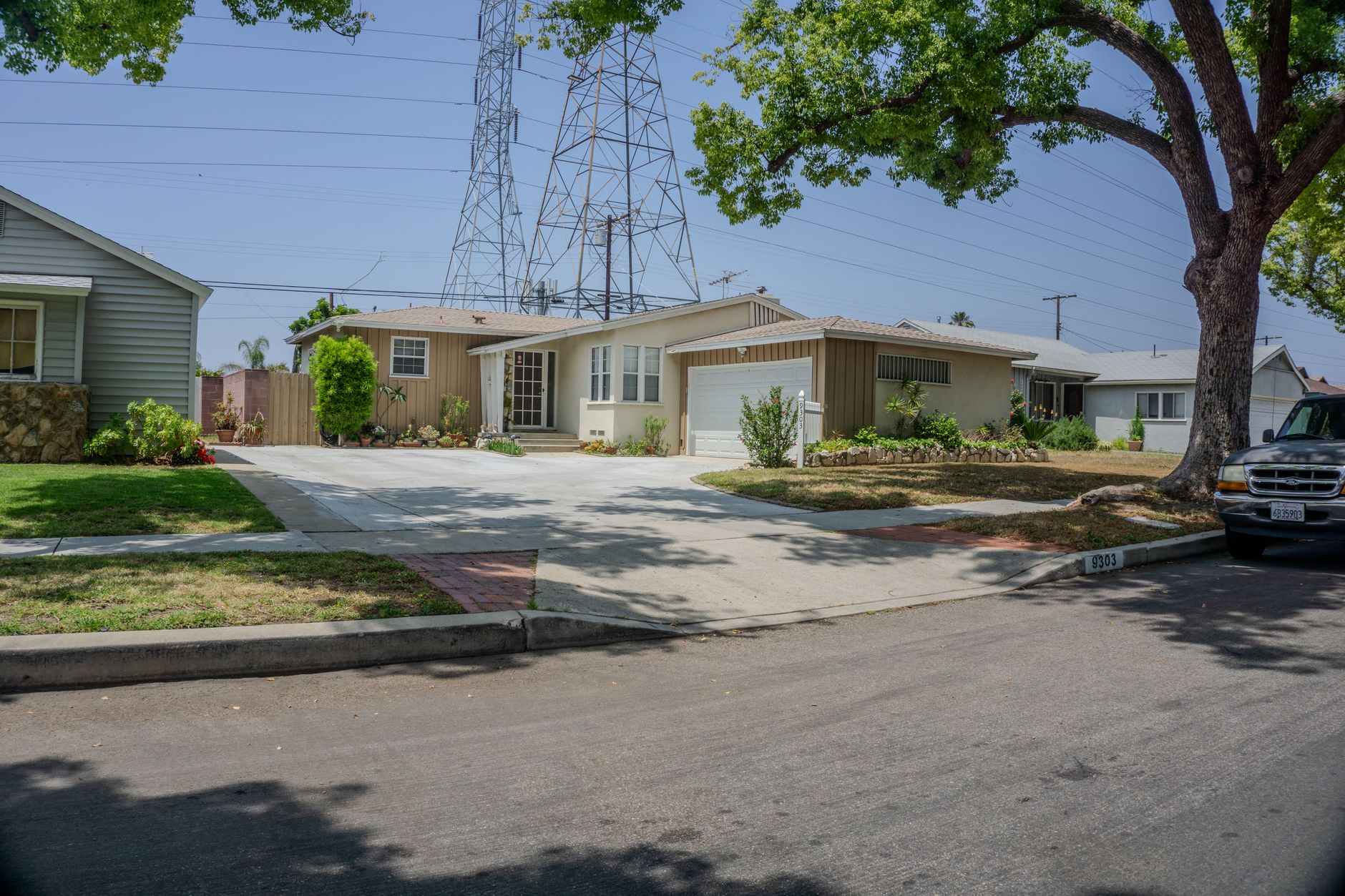
Carlsbad, Chula Vista, Santee, Rancho Bernardo, and every planned community built in the last three decades. These arrived with a two-color builder palette plus a garage door, and usually an HOA with something to say about changing it. Small moves win: deepen the body one or two steps from the builder beige, take the trim crisper, put the character into the front door. Painting the stucco pop-outs a shade off the body rather than bright white is the single change that most reliably takes a decade off a tract elevation.
Modern and contemporary exterior paint colors
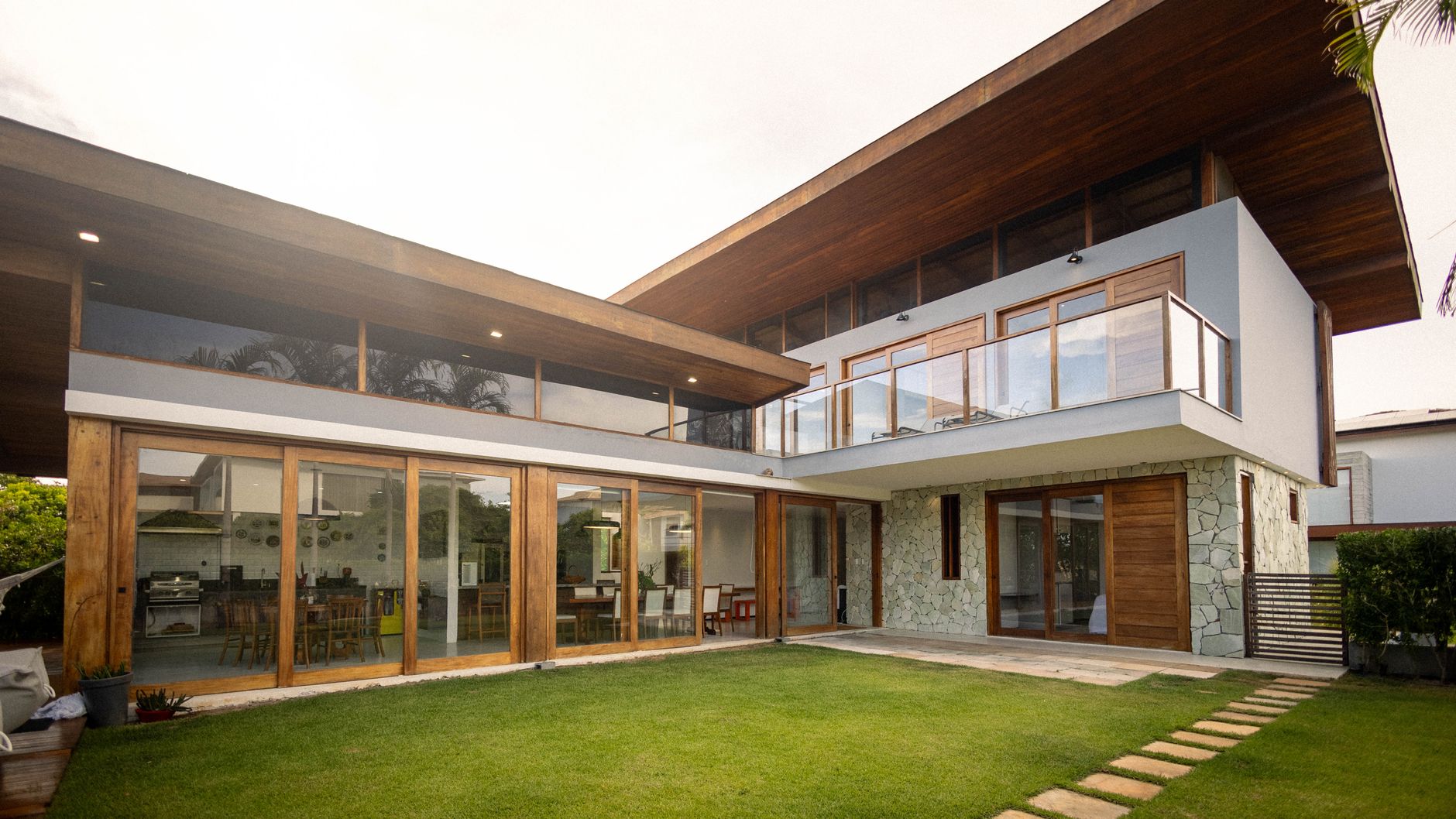
Modern exterior paint colors are less about color than about contrast and edge. The palette is usually two or three values of one neutral plus a dark, and the effect comes from where the line between them falls: an off-white body, charcoal or black window frames and fascia, natural wood at the door. It lets the geometry do the talking.
Contemporary exterior paint colors that hold up in San Diego light share one property: warmth in the base. Warm whites, greys with a greige foundation, deep charcoal, and soft blacks all stay looking intentional. Cold blue-based builder grey is the failure mode — in our light it goes visibly blue by mid-afternoon and reads dated faster than almost anything else.
A glass-heavy modern house is the one case where a genuinely dark body becomes practical, because the painted area is small. Low-sheen finishes support the look, since a flatter surface reads as one plane in bright light where satin picks up every undulation in the stucco. That is partly a product question — if your stucco has crack-bridging or waterproofing requirements, read our guide to elastomeric paint for San Diego stucco before locking a finish.
Black exterior door paint and the door question
A front door is the highest-return color decision on the house: a few square feet, one day of work, and it changes the first thing anyone sees. If your body color is sound and you are only bored, spend here first.
Black exterior door paint is the most-asked door color for good reason. It reads as deliberate against almost any body color here, it makes hardware look better than it is, and on white or sand stucco it does the job dark ironwork does on a Spanish home. Two details separate a black door that looks custom from one that looks flat: use satin or semi-gloss rather than a true flat, because flat black shows every fingerprint, and take the hardware off rather than taping around it. A taped lockset is visible from the sidewalk.
The San Diego caveat is sun exposure. A dark door on a west or south-facing entry with no overhang absorbs a great deal of heat, and dark colors on a fully exposed door are the fastest-aging paint on the property; on a solid wood slab that heat cycling works against the door itself. Most homes here have recessed or covered entries, which removes nearly all of it. If yours is genuinely exposed, go dark if you love it, but budget on refreshing the door years before the body.
Beyond black, the exterior door paint colors we specify most are deep charcoal, which gives nearly the effect of black with more tolerance for sun; deep olive, superb on sage, sand, and white stucco; muted navy, a natural on coastal cottages and Craftsman homes; oxblood and deep brick red, traditional on Spanish architecture; and saturated teal, at home on a beach bungalow in Encinitas and out of place three miles inland. Whichever you pick, doors get painted in shade, not in afternoon sun on the hinges.
Exterior paint color ideas with brick
Treat the brick as fixed and choose everything else to it. Brick is rarely the whole house in San Diego — usually a chimney, a wainscot, a planter wall, a mid-century accent panel — which makes it the element that should govern the scheme. Identify its dominant undertone from the street, not up close, because brick is a blend.
- Orange-red brick. Warm whites, creams, and soft greige for the body; deep green, black, or bronze for trim and doors. Avoid cool greys.
- Brown or tan brick. The most flexible case — greige, olive, warm bronze, and deeper earth tones all work, and this is the one brick that takes a warm mid-grey.
- Pink-toned brick. Whites with a soft yellow or cream base. Nothing with pink or mauve in it, because two pinks never resolve into one idea.
- Buff or blond brick. Handles warm and cool schemes both; deep charcoal trim against blond brick is one of the cleanest looks on a mid-century house.
Now the honest part, because exterior brick paint color ideas usually skip it. Painting brick is effectively permanent. Once masonry is coated it has to be maintained as a coating forever, and stripping it later is expensive, rarely complete, and can damage the face of the brick. A film-forming paint can also trap moisture inside the masonry, which leads to spalling. The National Park Service has published extensively on coatings and water-repellent treatments on historic masonry, and that caution applies to a 1958 chimney as much as to a landmark.
So the rule is short. If you might change your mind, do not paint the brick. If it genuinely has to change, a breathable mineral coating is the more considered route than a standard acrylic — limewash on San Diego masonry covers how that works. Either way, sample on the actual brick first.
Body, trim, and accent
The working rule is a hierarchy by area. The body covers the most square footage and should be the least saturated color. The trim is a shift in value, not usually in hue. The accent is small, so it can afford to be committed. Schemes fall apart when that inverts and the largest surface is the loudest.
Trim lighter than the body by two or three steps is the classic approach: it outlines the windows and roofline and makes the house look larger and better kept. The cost is precision, since every wobble in that line is visible from the street — a labor question, and one reason we cut trim by hand rather than handing it to a sub. Trim close to the body in value is quieter and is the right answer on most Spanish, Mediterranean, and modern homes, where the architecture does the work contrast would otherwise do.
A few pieces have their own logic. Fascia and gutters either match the trim or go dark to tie back to the roof. The garage door is the largest single element on most San Diego street elevations and should be a decision rather than an accident — body color to make it recede, accent to make it a feature, not a builder white that matches nothing.
What fades fastest in San Diego sun
Deep saturated colors fade fastest, and among those, reds and some blues fade fastest of all. That is pigment chemistry rather than a regional quirk: saturated colors carry far more colorant, and the organic pigments behind bright reds, purples, and some blues are less lightfast than the inorganic iron oxides behind earth tones. Whites, sands, greiges, olives, and clay tones hold longest.
Exposure matters as much as color. South and west elevations take substantially more UV over a year than north and east, and it shows — on a two-story house the west wall commonly reads a step lighter than the north wall long before the coating is anywhere near failing. The EPA publishes a plain explanation of the UV Index and what its numbers mean, and Southern California spends much of the year at the upper end of that scale.
On the coast, add salt. Salt aerosol settles on everything within roughly a mile of the water and stays, working at the edges of the coating film and attacking metal first. The visible failure is often not the wall but rust bleeding through the paint on railings, gates, and light fixtures, staining the body color underneath.
The honest framing: exterior paint in San Diego generally lasts 7 to 12 years, coastal exposures at the short end and protected inland elevations at the long end. Color choice does not move that band much. What it changes is how the house looks at year six.
So put deep color where the sun does not live: north elevations, recessed entries and courtyards, shutters, doors, under deep overhangs. For service life and product systems rather than color, our guides to elastomeric coatings for stucco and what exterior painting costs in San Diego cover both, and the best time of year to paint an exterior here covers when to put it on the wall.
HOA color approval, briefly
If you live in a planned community, check the approved palette before you buy a single sample quart. Most San Diego associations — concentrated in Carlsbad, Encinitas, and the newer inland communities — publish approved schemes or require an architectural submittal with color chips, and approval routinely takes longer than the painting. Submit first, sample second, schedule third.
If you are on the board rather than in the house, that is a different animal entirely, and we wrote it up in how an HOA board actually runs a community repaint.
Benjamin Moore, Sherwin-Williams, Dunn-Edwards
We color-match to all three, so the deck you shop is not the constraint. Benjamin Moore paint exterior colors are the most-searched fan deck in the country and plenty of clients arrive with one; Dunn-Edwards has a long Southern California presence; Sherwin-Williams is the most widely stocked. Two things cause most of the surprises.
A cross-brand match is close, not identical. Different manufacturers use different bases and colorants, so a match is a very good approximation rather than a clone. On a full repaint that is irrelevant. On a partial repaint where new work meets old, the difference shows on a large flat wall in raking afternoon light.
Record the formula, not the name. Whatever gets chosen goes into the paperwork as manufacturer, product line, base, and formula, with sheen specified per surface. Color names get discontinued and renamed; formulas do not. In five years, when a gate is replaced or a wall is patched, the formula saves you from repainting an entire elevation to match a two-foot repair.
Color matching with samples provided is part of how we quote, and estimates are free. To confirm that whoever is doing the matching is licensed, California's Contractors State License Board lookup settles it in thirty seconds. Ours is #794402-C33, bonded and insured.
When you should not repaint for color
This is the section that costs us work, and we write it anyway. Four situations where the right answer to a color question is not a repaint, plus one about brick.
When the substrate has not been dealt with. Choosing a color before anyone has looked at failing stucco, open cracks, soft wood at the fascia, dry rot around windows, or a sprinkler head hitting a wall for nine years is doing the steps in the wrong order. Paint over a moisture problem and the new color fails first and worst exactly where the problem is. Get the wall sound — our stucco repair page covers that — then pick a color.
When you are choosing from a chip, a screen, or a showroom. If you are not willing to put four large samples on three elevations and look at them across three days, do not commit to a body color yet. That week is free, and it is the difference between a color you like and a color you live with for most of a decade.
When the coating is sound and the color is merely dated. Run a dark sleeve down a sunny wall. If very little chalk comes off, the film is not powdering, and there is no lifting at the base of walls or peeling at the fascia, your paint is not finished — your taste is. That is a legitimate reason to repaint and we are happy to do it, but you are buying an aesthetic upgrade rather than protection. A new front door color, refreshed trim, and a painted garage door change a street elevation for a fraction of a full exterior.
When you want a very dark color on a west elevation and have not accepted the consequence. We will paint it. We will also tell you first that it will look different at year six than the north side does, that it will chalk sooner, and that a touch-up there will not blend. If you expect that wall to match the sample board in 2032, choose lighter or move the dark color to the entry or the door.
And the fifth: do not paint brick because you are unsure about it. Painting brick is a decision you make once, and being unsure is the wrong reason to make a permanent choice.
Color is the part of a repaint everyone has an opinion about, and it is also the part that is free to get right. If you want a second opinion, or you want to know whether your exterior is actually due before you start choosing, call us. No forms, no hold music — Joe or Alex on the line. One of us is on every job site every day. The rest of what we do is on our services page.
FAQ
How many exterior paint samples should I test, and where should I put them?
Four colors, painted at least two feet by two feet in two coats, on at least three elevations: the front, a south or west wall where the sun is strongest, and a shaded north wall. Place each patch next to what you are not changing — the roof line, the window frames, any stone or brick. If a color works on all three walls, it works on your house.
Why does an exterior color look different on my house than it did on the paint chip?
Because San Diego light is far more intense than the light you chose in, and intense light washes chroma out of a color, so it reads lighter outdoors. Near the coast the ambient light is also cooler, pushing colors toward grey and blue, while stucco texture pulls the other way by adding shadow. The only reliable fix is large samples on the actual wall at different hours.
Which exterior paint colors fade fastest in San Diego?
Deep saturated colors, and reds and some blues fastest among those, because the organic pigments used to reach those hues are less lightfast than the iron oxides behind earth tones. Whites, sands, greiges, olives, and clay tones hold longest. Exposure matters as much as hue — south and west elevations age visibly faster, so a deep color can still do well in a recessed entry.
Should my body color match or contrast with a terracotta tile roof?
Neither, exactly. Aim for a body color in the same warm family as the tile but at much lower intensity, so the roof stays the saturated element. Warm whites, cream, sand, neutral greige, olive, and soft low-chroma clay all do that. Avoid undertones with competing pink or red, and avoid cool blue-greys, which pull against warm terracotta.
Can I paint the brick on my San Diego home, and can it be undone?
You can paint it, and realistically you cannot undo it. Once masonry is coated it has to be maintained as a coated surface indefinitely, and stripping it later is expensive and can damage the face of the brick. A film-forming paint can also trap moisture in the masonry, which leads to spalling. If you are unsure, leave it.
Is a black front door a bad idea in full San Diego sun?
Not a bad idea, but a trade to make knowingly. A dark door on a west or south-facing entry with no overhang absorbs a lot of heat and is the fastest-aging paint on the property, and on a solid wood slab that heat cycling works against the door itself. A recessed or covered entry removes nearly all of that.
How do I pick a trim color once the body color is decided?
Decide which of two effects you want. Trim two or three steps lighter than the body outlines the windows and roofline and makes the house read larger and sharper, which demands clean cut lines. Trim close to the body in value is quieter and lets the architecture carry the house, the right answer on most Spanish, Mediterranean, and modern homes.
Should I match my neighbors' exterior paint colors?
Match the street, not the house next door. Look at the four or five homes visible from your curb and make sure your body color is not a near-miss of any of them, because a slightly different version of a neighbor palette looks like a mistake while a clearly different one looks like a choice.
Penney's Professional Painting — exterior, interior, and cabinet painting across San Diego County since 2007. CA #794402-C33, bonded and insured, zero subcontractors.
We color-match to Benjamin Moore, Sherwin-Williams, and Dunn-Edwards, and we will put real samples on your actual wall before anyone commits to a color. Estimates are free, and if your coating is still sound we will tell you that too.
Walk the job with Joe or Alex.
Tell us what you're thinking. We'll come look, point out what we'd do differently, and only quote what we'd paint in our own house.