
Kitchen Cabinet Paint Colors for San Diego Kitchens: Whites, Greens, Blues, and the Walls That Go With Them
Joe Penney has been painting in San Diego County since 2007 and in the trade for over 35 years. Every job — residential, commercial, and specialty coatings — is run by Joe or his son Alex personally. No subcontractors, no franchise crews. CA License #794402-C33.

Quick answer
The kitchen cabinet paint colors that work in San Diego are warm-leaning whites, sage and olive greens, navy and slate blues, and greige, with black and charcoal reserved for islands and lower cabinets in rooms that get real daylight. Pick the counter first, because the cabinet color has to answer to it. Then test the finalist under your actual under-cabinet lights, because a 2700K bulb and a 4000K bulb will turn the same white into two different colors, and most cabinet regret in this county traces back to that one detail.
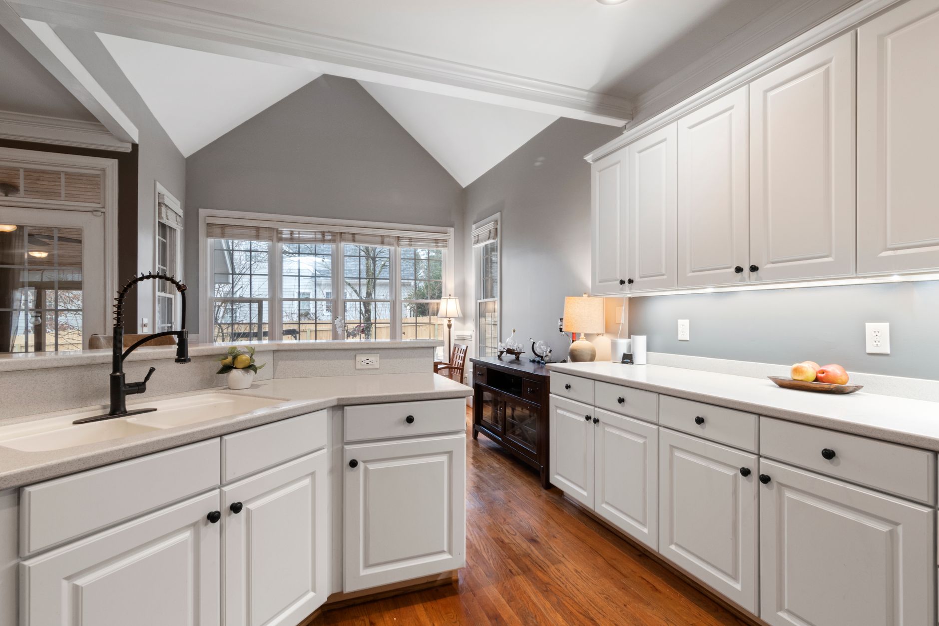
There are more whites on a Sherwin-Williams fan deck than there are mornings of marine layer in a San Diego summer, and I have stood at a kitchen island in La Mesa while a client told two of them apart from across the room. I nodded along like a man pretending to hear the difference between two speaker cables. She was right, as it turned out. Kitchen cabinet paint colors are the one interior color decision where the difference between two nearly identical chips genuinely shows up on the finished job.
This post is about choosing the color, and the wall color that goes with it, for a San Diego kitchen. It is not about what cabinet painting costs, how the doors get sprayed, or which enamel goes on them — our kitchen cabinet refinishing guide covers all of that. What you will walk away with is a short list of colors that hold up in this county's light, real pairings for the walls, and the situations where the fashionable choice is the wrong one. We have been painting San Diego County since 2007, with 35+ years in the trade behind the crew and zero subcontractors.
Why cabinet color is a bigger decision than wall color
Cabinets are the largest continuous block of color in the kitchen, the most expensive surface in the room to redo, and once painted they fix the palette for everything else. That is why the cabinet color deserves a week of your attention and the wall color deserves an afternoon.
Take the size point first. In a typical San Diego kitchen the walls are mostly interrupted — by windows, a slider to the patio, the backsplash, the uppers themselves. What you actually see at eye level is cabinet, and color behaves differently at that scale. A tint that looked restrained on a chip becomes the dominant note in the room. A white with a faint yellow base reads as cream once there is forty square feet of it.
The cost point is simple and the numbers live in the refinishing guide. Repainting a wall you regret is a weekend. Repainting cabinets you regret means doors off, the kitchen out of service, and a spray finish done twice.
The palette point is the one people underestimate. Cabinet color sits directly against the counter, the backsplash and the floor, and it either agrees with all three or argues with one of them. A cool grey cabinet against a warm travertine floor argues. A warm white against a stark grey-veined quartz argues. The walls touch none of those materials and can be adjusted around whatever the cabinets decide. Choose the cabinets with the counter sample in your hand, then choose the walls last.
White kitchen cabinets: the majority choice and the hardest to get right
A good white paint for kitchen cabinets is one whose undertone agrees with your counter and reads clean under your lights, and no white does both in every kitchen. White is the cabinet color we spray most by a wide margin. It is also the one we get the most anxious phone calls about, because the failure is subtle: the cabinets are not wrong, they are just slightly cream, or slightly grey, and the client cannot say why the room feels off.
Every white has an undertone. Warm whites carry a little yellow, red or brown; cool whites a little blue, green or grey; a pure white sits in the middle and shows whatever is nearest to it. The undertone is invisible on a chip held alone and obvious next to the counter.
Warm quartz and warm stone want a warm white. A counter with cream, beige or gold movement, and most of the terracotta and Saltillo floors in the county's Spanish and Mediterranean stock, will make a cool white look blue and sterile. The soft, slightly warm whites read as white in the room without fighting the warmth around them.
Cool marble and grey-veined quartz want a cleaner white. Put a warm white next to bright white marble or grey-veined quartz and the cabinet turns yellow by comparison; a pure or very slightly cool white holds its own. Stainless and matte-black hardware push a warm white the same way.
The lights finish the job. A white that looks clean on a chip in daylight sits, on the finished cabinets, directly above and below a run of LED strip lighting. A warm LED throws amber onto the underside of the uppers and across the backsplash, and any white with a warm base goes visibly yellow in that band. A cool LED turns a warm white grey and flat. The light section below covers the test; the short version is that you have not chosen a white until you have seen it under the bulbs you own, at night, with the overheads off.
Green paint colors for kitchen cabinets
Green is the strongest non-white cabinet color for a San Diego kitchen, because of what it sits next to. Most kitchens here look out at something growing — a patio, a hedge, a lemon tree — and a green cabinet borrows that view. Three families cover nearly every kitchen we paint green, and they behave very differently.
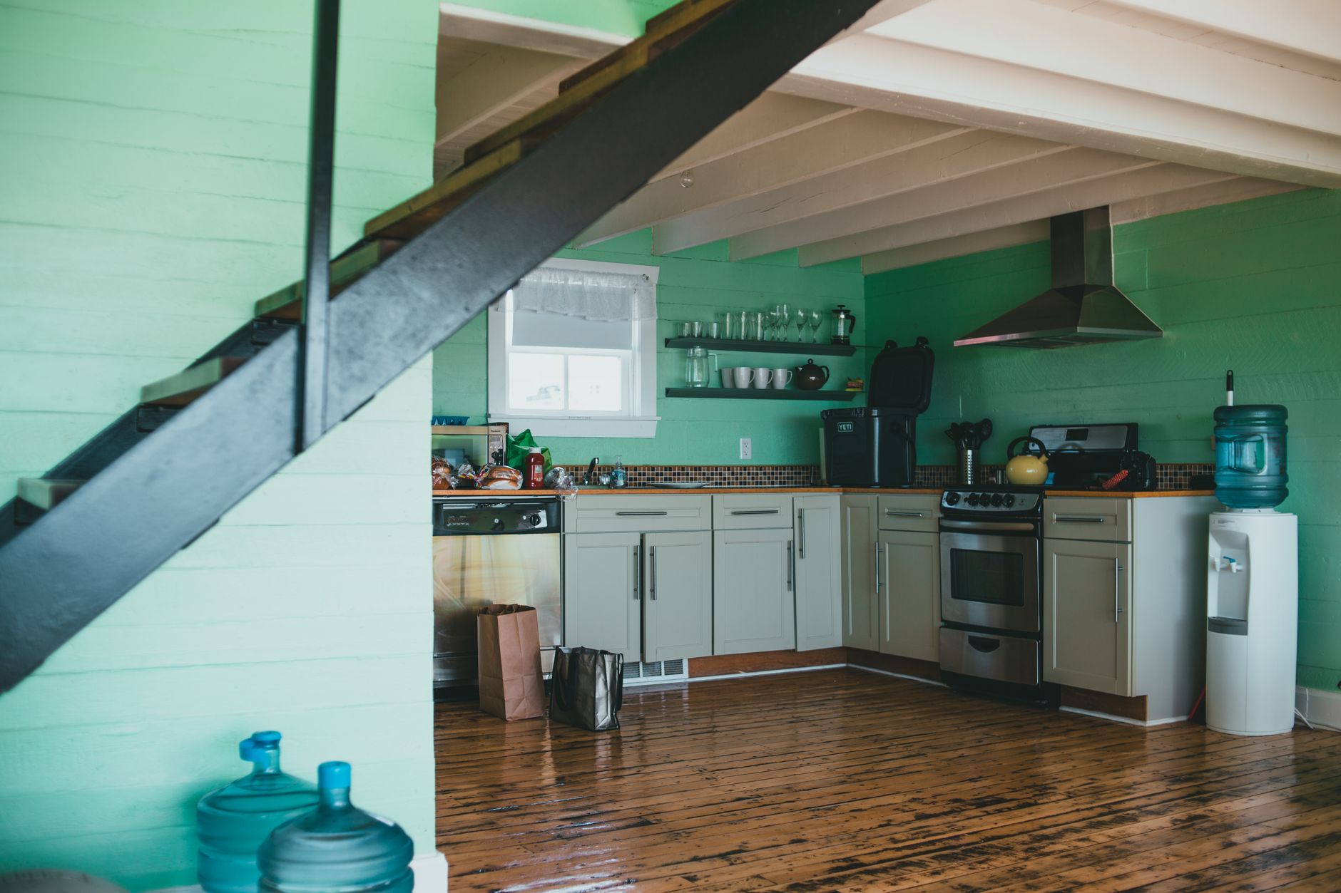
Sage and grey-green. The softest of the three and the one that reads as a neutral from across the room. Sage takes daylight well, does not go dark in a north-facing kitchen, and sits comfortably against warm and cool counters alike, which makes it the safest green for a whole kitchen. Against a terracotta floor it is the classic Mediterranean pairing. Against white quartz it reads fresh and modern. The risk is that the greyer sages go flat under a cool LED, so it wants a warm bulb.
Olive and khaki-green. Warmer and more saturated. Olive is at its best in a bright kitchen with a lot of natural wood — a walnut island top, oak floors, a butcher block — where the yellow in the green picks up the yellow in the timber. It flatters brass hardware more than any other cabinet color. The risk is that a small, dim kitchen turns olive muddy. Olive needs light to look expensive.
Deep forest and hunter green. The dramatic one. Deep green on the lowers or the island under white uppers is one of the most photographed kitchens of the last few years, and it earns it: it reads as furniture rather than cabinetry and makes a white counter look brighter by contrast. Two cautions. It absorbs light, so it belongs in a kitchen with light to spare — a north-facing galley is not the place. And it shows dust and water spots more than a mid-tone does.
Sage and olive have a long history in this county's Spanish Revival, Craftsman and mid-century kitchens; they came back because they never really left. The saturated deep greens are more of a moment, which is why we tend to put them on the island rather than every door.
Blue paint colors for kitchen cabinets
Blue paint colors for kitchen cabinets split into navy, slate and dusty blue, and the coast decides which one you can get away with. Blue is where the difference between a La Jolla kitchen and an El Cajon kitchen matters most, because coastal light is already blue and inland light is not.
Navy. The most forgiving dark color in the cabinet palette. Navy reads as a neutral the way black does, but it has depth in daylight where black goes flat, and it pairs with every metal finish. It is the standard answer for a dark island or dark lowers under white uppers, and it looks right in a Coronado bungalow and in a new Carlsbad build. Watch the undertone: a navy with a green or teal base can turn petrol under warm LEDs, while a navy with a red or purple base holds truer.
Slate and blue-grey. The quiet one. Slate sits between grey and blue and reads as one or the other depending on the light, which is its risk here. Within a mile or so of the water, light off a blue sky and a blue ocean pushes slate firmly toward blue, and a color that was a sophisticated grey on the chip is a blue kitchen by mid-morning. Ten miles inland the same slate stays grey. If you are on the coast and want grey, choose a grey.
Dusty and powder blue. Soft, chalky blues — the cottage colors. They are charming on a small kitchen's lowers or a pantry run, and in the beach cottages of Encinitas and Leucadia they suit the house. On every door of a large kitchen they can read as a nursery. The paler the blue, the smaller the surface it should cover.

Greige, taupe, black and charcoal
Greige and taupe are the good colors to paint kitchen cabinets when white feels too stark and a real color feels like too much. Black and charcoal are the right answer for one part of the kitchen and the wrong answer for the rest of it.
Greige. Grey with enough warmth that it does not go cold. It replaced the flat mid-tone greys of a decade ago, and on a full kitchen it reads calm and slightly upscale. It is very good at bridging a warm floor and a cool counter, a common problem in remodels where the floor stayed and the counter changed. Watch it at the coast, where the same cool light that pushes slate to blue pushes greige to plain grey.
Taupe and mushroom. Warmer still, with brown and a little pink in the base. Taupe is the natural cabinet color for the county's Spanish and Mediterranean houses, sitting between the terracotta floor and the cream stucco without competing with either. Inland, in the warmer light of La Mesa and east county, it can tip pink in the afternoon; choose one on the greyer side if that worries you.
Black and charcoal — where they work. On an island. On the lowers under white or pale uppers. On a single tall pantry wall in a big, bright kitchen. There a black or charcoal cabinet reads as furniture, anchors the room, and makes every lighter surface near it look cleaner. The mid-century houses in Clairemont, Allied Gardens and Del Cerro, with their flat-slab doors and open plans, take black lowers particularly well, because a slab door has no profile to lose in a dark color.
Black and charcoal — where they do not. On every door in a small kitchen. In a north-facing kitchen with one window. On a heavily profiled door, where the shadows that make the profile legible disappear into the paint. Black on all the uppers lowers the visual ceiling and makes the kitchen feel smaller than its dimensions, and there is no lighting fix once the doors are hung.
Two-tone kitchens: lowers, uppers and the island
A two-tone kitchen looks intentional when the darker color is on the bottom, the two colors share an undertone, and there is a clean architectural line where one stops and the other starts. Break any of those three and the same two colors look like the painter ran out of one of them.
Dark down, light up. Dark lowers ground the room and hide scuffs at shin height; light uppers keep eye level open and bounce the daylight around. Reverse it and the room feels top-heavy. The only common exception is a kitchen with no uppers at all, where the wall takes the lighter role.
Share an undertone. A warm white upper over a navy lower works because both can carry a touch of the same warmth. A cool blue-white upper over a warm olive lower fights, because the two colors disagree about what temperature the room is. Hold both chips against the counter at once; if one looks yellow and the other blue, one of them is wrong.
Find the line. The change of color needs an edge to happen on. A counter is an edge. The end panel of an island is an edge. A floor-to-ceiling pantry is one color, never split at counter height — the most common two-tone mistake we are asked to fix. No natural break, one color.
The colored island. The lowest-risk version of two-tone, and the one we suggest most. Perimeter cabinets stay white or pale; the island takes the color — navy, deep green, charcoal. It lets a homeowner have the dramatic color without living inside it, and if taste changes in six years, the island alone gets repainted. The commercial version — a colored bar front, neutral back-of-house — gets its own treatment in our commercial cabinet finishing guide.
Kitchen paint colors that pair with your cabinets
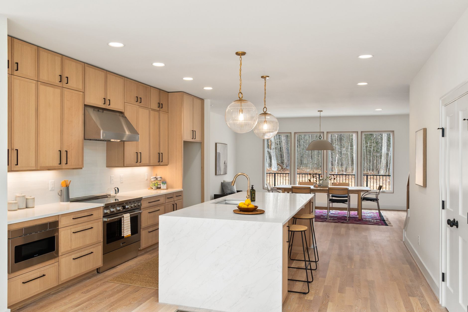
The wall color in a kitchen should be quieter than the cabinets and share their undertone, and in most San Diego kitchens there is less wall than people think — the backsplash, the window and the slider have taken most of it. The walls do not have to carry the room. They have to agree with the cabinets and get out of the way. Pairings by cabinet color:
Kitchen paint colors with white cabinets. The most-asked color question we get, and the answer depends on which white. Warm white cabinets take a soft greige, a pale warm grey, or a slightly deeper version of the same warm white, so the cabinets read as the brightest thing in the room. Cool or pure white cabinets take a pale cool grey, a soft blue-grey, or a very light sage. To make the walls disappear, paint them the cabinet white and let the sheen change separate them — the sheen guide explains why a satin cabinet against an eggshell wall reads as two surfaces in one color. For a little life, a muted sage or dusty blue-green wall with white cabinets photographs best in a bright San Diego kitchen and never looks like a mistake.
With sage or olive cabinets. Warm white or cream walls, always. Green cabinets against green walls turns the kitchen into a single color mass and loses the whole point. A soft warm white lifts the green and keeps the room bright.
With navy or slate cabinets. Clean white or a pale warm grey. Navy needs the contrast to read as rich rather than heavy, and a warm-leaning wall keeps a coastal room from feeling cold.
With greige or taupe cabinets. A white one or two steps lighter than the cabinet, in the same undertone family. Greige cabinets against a stark cool white look dirty; against a warm white they look intentional.
With black or charcoal lowers. A clean white or pale warm grey above. Never a second dark. The room needs the top half to be light.
One more rule: kitchens here nearly always open into a living room, and the wall color has to make sense from the sofa. Carry the living room color into the kitchen and let the cabinets be the change. Our interior painting work treats the two rooms as one job for exactly this reason.
Kitchen light in San Diego: north, west and the LEDs under the uppers
San Diego light is bright and cool at the coast and warm and hard inland, and our exterior paint colors guide explains the mechanism and the sampling method. What is specific to a kitchen is that three different light sources hit the cabinets in a day, and a color has to survive all three.
The window and the slider. San Diego kitchens are unusually open to the outside. The typical remodel adds a slider or a wall of glass to the patio, so the kitchen takes more exterior light than in most markets, in the exterior's color. A north-facing kitchen gets cool, steady light all day — whites go slightly grey, greige goes grey, slate goes blue. A west-facing kitchen with a slider gets low, hot, orange light from about three in the afternoon, and for two hours every white is cream and every green is olive. Neither is a problem if you chose the color knowing it.
Coastal versus inland. Within a couple of miles of the water — La Jolla, Del Mar, Coronado — the daylight through that glass is blue-white and cools every cabinet color a step. Warm whites are the safe whites there because the light pulls them back toward neutral. Inland the light is warmer and more direct, and the same warm white can look yellow; a cleaner white or a soft greige holds better.
The lights under the uppers. This is the one that decides most white kitchens and gets tested least. Here is the opinion we will defend on any job site: the color temperature of your under-cabinet LEDs matters more to how a white cabinet reads than which white you picked. A 2700K strip is amber-warm; it throws yellow onto the backsplash and the underside of the uppers, and a warm white goes butter-yellow in that band while a cool white goes cream. A 4000K strip is neutral-cool; under it a warm white goes flat and slightly dirty and a cool white looks crisp. Same cabinets, same paint, different bulb, different kitchen. The U.S. Department of Energy has a plain-English explanation of LED color temperature; the practical version is on the box of every LED strip in the store.
So the kitchen-specific test is this. Prop the painted sample board against the backsplash, under the uppers, where a door will hang. Look at it mid-morning, at four in the afternoon, and after dark with only the under-cabinet lights on. If it passes all three, it is your color. If it fails only the night test, change the bulbs before you change the paint — the cheaper fix by far, and the one nobody thinks of.
Sherwin-Williams, Benjamin Moore and Dunn-Edwards cabinet colors
We color-match to Sherwin-Williams, Benjamin Moore and Dunn-Edwards, so whichever fan deck is on your kitchen table is the one we work from. Sherwin-Williams kitchen cabinet paint colors are the most-searched of the three, so the list leans that way, with Benjamin Moore alongside. These are names, not recommendations; the right one is the one that passes the light test in your kitchen.
Whites. On the warm side, Sherwin-Williams Alabaster and Greek Villa and Benjamin Moore White Dove and Swiss Coffee are the ones we spray most often in the county's Spanish and Mediterranean houses; Dunn-Edwards Whisper and Swiss Coffee sit in the same territory. On the clean side, Sherwin-Williams Pure White and Extra White and Benjamin Moore Chantilly Lace and Simply White are the standard answers for cool marble or grey-veined quartz. Sherwin-Williams Snowbound and Benjamin Moore Cloud White are the in-betweens.
Greens. Sherwin-Williams Evergreen Fog is the sage-grey that put green cabinets back on every mood board, with Retreat and Pewter Green as the greyer, deeper neighbors and Rosemary as the true deep green. Benjamin Moore October Mist and Saybrook Sage are the soft sages; Salamander and Essex Green are the deep forest colors for an island.
Blues. Sherwin-Williams Naval is the color we are asked for by name more than any other on this list; Cyberspace is the slate-navy alternative. Benjamin Moore Hale Navy is the equivalent, with Van Deusen Blue and Newburyport Blue as softer navies and Gentleman's Gray as the blue-charcoal option.
Greige, taupe and dark neutrals. Sherwin-Williams Agreeable Gray and Accessible Beige; Benjamin Moore Revere Pewter, Edgecomb Gray and Pale Oak. For black and charcoal, Sherwin-Williams Iron Ore, Tricorn Black and Urbane Bronze, and Benjamin Moore Kendall Charcoal and Wrought Iron, are the ones on islands across the county.
Two things about names. A cross-brand match is close, not identical. And names get retired; formulas do not, so whatever you choose goes into our paperwork as manufacturer, base and formula, and a chipped door in five years can be matched without repainting the run. Our cabinet refinishing page has the rest of what a job includes.
When you should not repaint your cabinets for color
This is the section that costs us work, and we write it anyway. Four situations where the color you are excited about is the wrong move, or where the repaint itself is.
Do not put a trendy dark color in a small, north-facing kitchen. Deep green, navy and black need daylight to have depth. In a galley with one north window they have none, and the room becomes a dark corridor that no under-cabinet lighting rescues. If you love the color, put it on the island and keep everything else pale. If there is no island, it is not the kitchen for that color, and we will say so at the estimate.
Do not choose the cabinet color before the counter is chosen. We are asked to do this on nearly every remodel where the paint is scheduled ahead of a counter swap, and the answer is always the same: wait. The counter is the surface the cabinet has to agree with, and it cannot be adjusted afterwards. If the schedule forces the paint first, pick a mid-warm white that tolerates the widest range of counters, and accept that it is a compromise.
Do not pick from a chip or a phone screen. One sentence, because our exterior colors guide covers the method: a painted sample board, in the room, under the real lights, over several days, is the only test that means anything.
Do not repaint a color you like because someone told you it is dated. If the doors are sound, the finish is intact and you still like walking into the kitchen, the cabinets are not a problem. A color that is out of fashion this year is back in eight, and honey oak, painted cream and forest green have all been through that cycle since we opened. Spend the money on the counter, or on nothing. When the finish is genuinely failing — chipping, peeling, sticky — that is a different conversation, and the refinishing guide covers when it is worth doing and when it is not.
The cabinet color is the decision the rest of the kitchen answers to, and getting it right costs a few sample quarts, a week of looking, and one evening with the overheads off. If you want somebody to hold the board under your lights and tell you the truth, call us. No forms, no hold music — Joe or Alex on the line. One of us is on every job site every day, and the licence is public: California's Contractors State License Board lookup will confirm ours, #794402-C33, bonded and insured. The rest of what we do is on the services page.
FAQ
Should upper and lower kitchen cabinets be different colors?
They can be, and when they are, the darker color goes on the lowers. Dark lowers ground the room and hide scuffs; light uppers keep eye level open and bounce daylight. The two colors should share an undertone and change at a clean line such as the counter, and a floor-to-ceiling pantry stays one color. If the kitchen is small or dim, one light color on everything is the safer call.
What wall color goes with white kitchen cabinets?
A color quieter than the cabinets that shares their undertone. Warm white cabinets take a soft greige or pale warm grey; cool white cabinets take a pale cool grey, a blue-grey or a light sage. Painting the walls the same white as the cabinets and letting the sheen change separate them is a clean option in a bright San Diego kitchen. A muted sage or dusty blue-green wall is the pairing that adds life without ever looking like a mistake.
Does a dark island make a kitchen feel smaller?
Not if the perimeter stays light. A navy, deep green or charcoal island in a kitchen with pale uppers and light walls reads as a piece of furniture and anchors the room; the light surfaces around it still carry the space. What shrinks a kitchen is dark on the uppers, which lowers the visual ceiling, or dark on every door in a room without much daylight. Keep the dark below counter height and the room keeps its size.
Do painted cabinets show fingerprints more in certain colors?
Yes. Black, charcoal and deep navy show fingerprints, dust and dried water spots more than any mid-tone, because the oils sit as a lighter smear on a dark field. Sage, greige and taupe hide marks best. Whites show grime at the handle edges over time but hide dust. If the kitchen has young children or a lot of cooking, a mid-tone on the lowers is the practical choice.
How do I choose between a warm white and a cool white for cabinets?
Hold the chips against the counter, not against each other. If the counter has cream, beige or gold movement, or the floor is terracotta or warm wood, a warm white belongs; a cool white will look blue beside them. If the counter is bright white marble or quartz with grey veining, a pure or slightly cool white belongs, and a warm white will look yellow. Then check the winner at night under your under-cabinet LEDs, because a warm bulb pushes any white toward cream.
Will green or blue kitchen cabinets look dated quickly?
Sage, olive and navy have a long history in San Diego kitchens — Spanish Revival, Craftsman and mid-century houses have all used them — and they read as classic rather than trendy. The saturated deep greens and powder blues are more of a moment. If that worries you, put the stronger color on the island alone and keep the perimeter white, so a change of taste means repainting one piece rather than every door.
Should the cabinet color match the trim and doors in the kitchen?
With white cabinets, yes — use the same white on the trim, baseboards and interior doors so the kitchen reads as one clean envelope. With colored cabinets, no. Trim stays a white that shares the cabinet color's undertone: a warm white with sage or taupe, a cleaner white with navy or charcoal. Painting trim to match a colored cabinet spreads the color onto surfaces where it has no job to do and makes the room feel smaller.
Can cabinets be painted a much lighter color than the wood they are now?
Yes. Dark stained oak, cherry and espresso cabinets go to white, sage or greige routinely; the existing wood does not limit the color you can choose. What it affects is texture — open-grained oak keeps a faint grain pattern under paint unless it is filled, which shows more under a pale color than a dark one. Our refinishing guide covers how that is handled; it does not change which color you pick.
Penney's Professional Painting — cabinet, interior, and exterior painting across San Diego County since 2007. CA #794402-C33, bonded and insured, zero subcontractors.
We color-match to Sherwin-Williams, Benjamin Moore and Dunn-Edwards and provide samples with the estimate. If the color you have chosen will not work in your light, we will tell you at the kitchen island before anybody opens a can. Estimates are free.
Walk the job with Joe or Alex.
Tell us what you're thinking. We'll come look, point out what we'd do differently, and only quote what we'd paint in our own house.